Designing a packing-list app with AI: Packlight
A packing-list design concept with its original prompt, four screenshots and the refinement that made its visual direction consistent.
By Cicrew · Updated
Keep the first version about packing
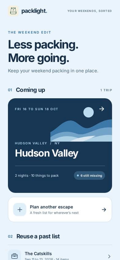
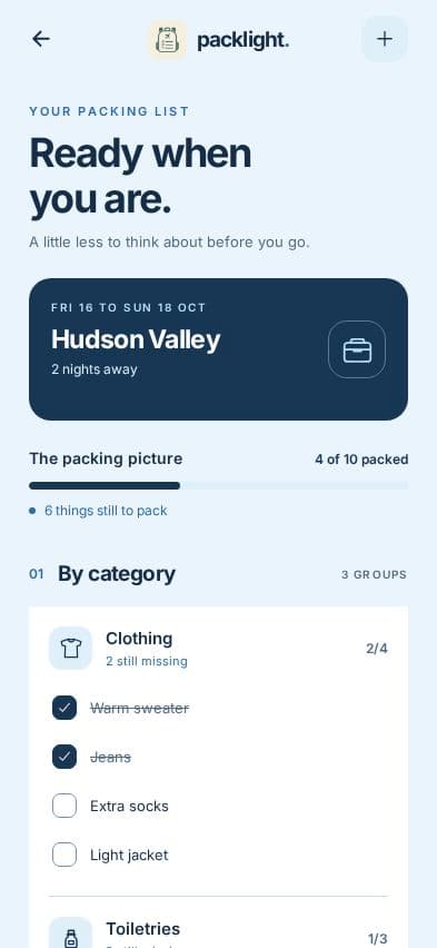
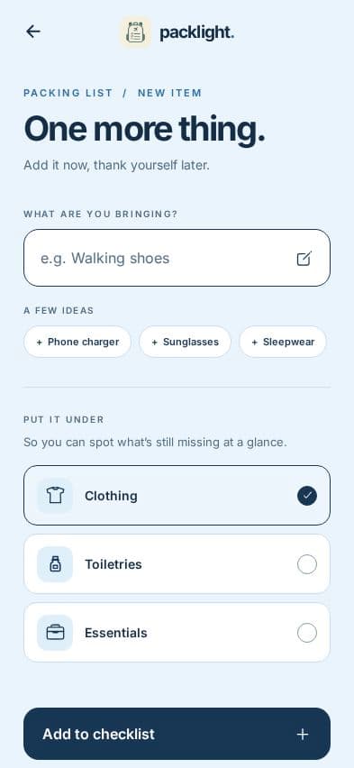
Packlight starts with a repeat problem: making nearly the same packing list for every short trip. The intended journey is to choose a trip, check what is still missing and add an item without losing your place.
We used Cicrew to make this design concept on September 28, 2026. The screenshots contain fictional trips and sample items. The project stopped at Design; checklist persistence, copying a trip and travel integrations have not been demonstrated as working features.
Travel bookings and live weather are outside this concept. Leaving them out keeps the review focused on the packing task, the category structure and whether the progress indicator is easy to understand.
The original prompt
This prompt describes actions as well as screens. That makes it possible to review whether the design represents the journey we intended, rather than judging four attractive screens in isolation.
A mobile app called Packlight helps people reuse a packing checklist for short trips. Include My trips, a trip's packing checklist with categories and progress, Add an item, and Trip details with dates and destination. People can copy a previous list, tick packed items and see what is missing. Use sky blue, dark navy and warm white, clear category icons, large touch targets and an uncluttered layout. Use fictional trips and sample items. This is a CiCrew marketing design concept. Complete Idea, Brand and Design only; stop before Plan, Build, payments or publishing. No travel bookings, live weather or external integrations.
A specific refinement made the palette consistent
We reviewed the first output and requested a consistent sky blue, white and navy treatment across the four screens, including the illustration. We also requested an icon correction and clearer date ranges. The final images below were captured after that revision.
This illustrates a useful review habit: identify the affected screens, the exact visual change and what should stay the same. A focused request is easier to check against the next result.
Refine all four Packlight screens: use pale sky blue backgrounds, white cards, dark navy text/buttons and blue accents instead of forest green and cream. Recolor the trip illustration too. Keep layouts and demo data. Replace sparkle icons with a toiletry bottle icon. Use "to" in date ranges. Inspect all four renders and run design checks. Stop at Design; no Plan, Build or publishing.
The final concept screens
The checklist shows a sample count of four items packed out of ten, grouped by category. That number is demo content. In an implementation, the total and each category count should derive from the same saved items.
Turn the concept into testable requirements
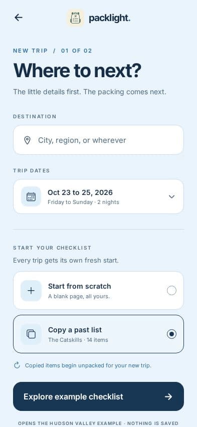
Before building, settle how a copied trip behaves. Should its items start unpacked? Should custom categories carry over? These choices affect stored data, not just the appearance of the copy action.
Then test creating a trip, adding an item, ticking it, undoing the action and reopening the app. Check the total when an item is deleted. Try a long destination name, no trips and a trip with no items. These are proposed checks, not tests already passed by this concept.
- Choose one date format and use it in both setup and trip cards.
- Keep the same category names in the checklist and Add an item.
- Define the empty and fully packed states.
- Check touch targets and scrolling on a small phone before release.
Keep planning your app
- Designing a plant-care app from a prompt: Leaflet
- Designing a reading tracker from a prompt: Chapter
- Mobile app prompt examples: describe a useful first version
- Mobile app launch checklist: from a working build to release
- How to publish an AI-built app to the App Store and Google Play
- What does it cost to build and run an app with AI?
- Your app, your accounts: code, databases and environment setup